My Process

Posted in Uncategorized on December 6, 2012 by matthewsgood

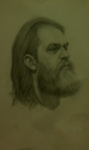
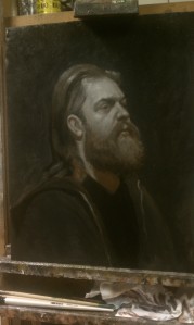
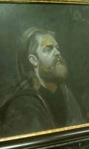
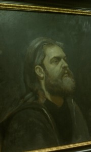
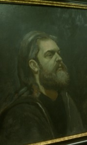
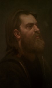
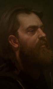
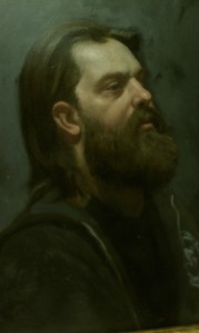
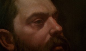
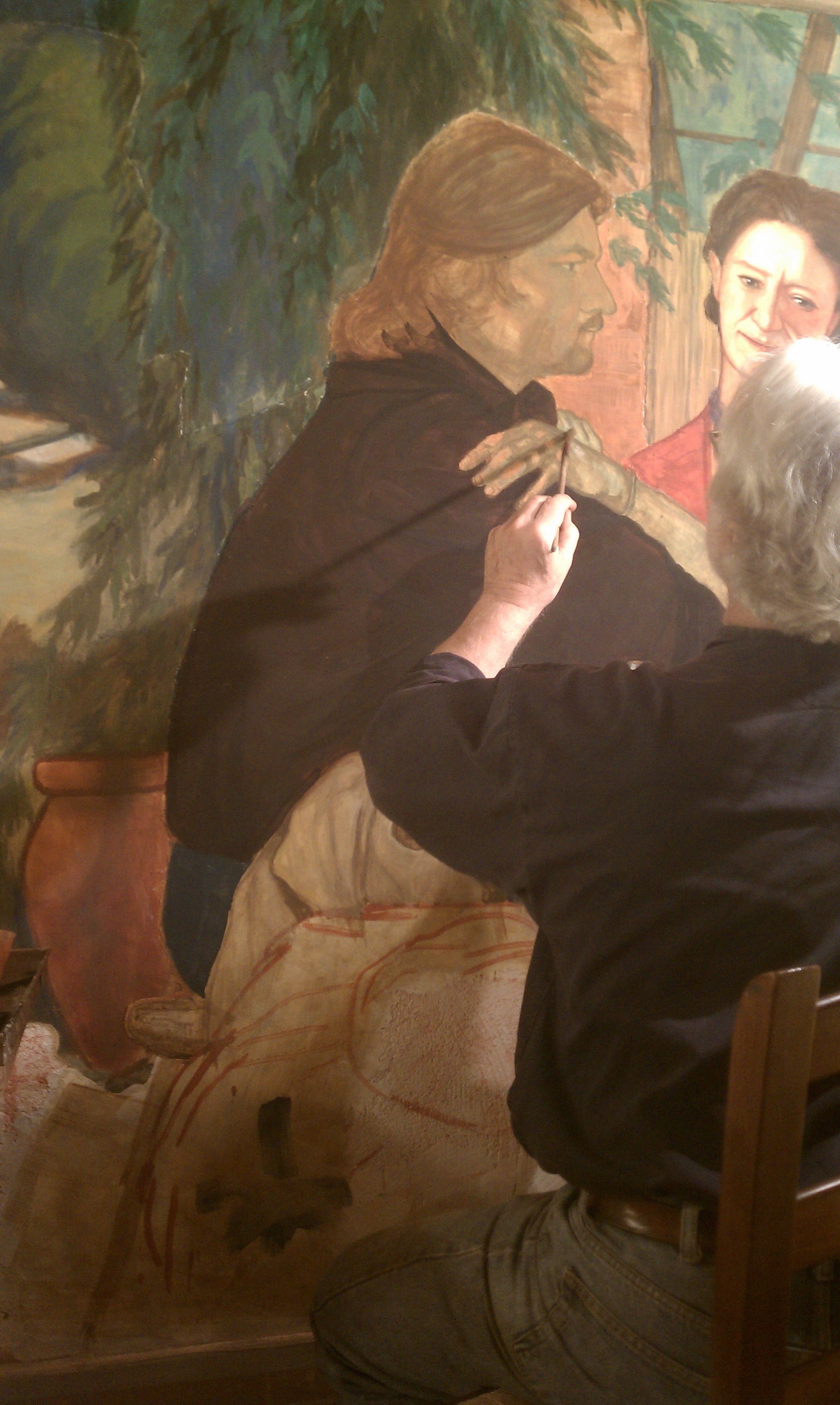
I admit, I always end up painting every painting uniquely but this is my basic approach to portraiture. I pretty much always start with a drawing. I use this to familiarize myself with the subject and use it to paint my grisaille from. I always use a grisaille for portraits. I usually draw on a cool toned canvas (a mix of flake white, ivory black, and yellow ochre) with warm paint (burnt umber) and keep the shadows warm and thin. I then block in the lights using a cool grey mixture (In this case, green umber and white) and try to lay on a good amount of paint to give it body. I will let this dry thoroughly before adding color. I begin the color stages by oiling in with a warm glaze. In this case raw sienna. I apply it all over the entire portrait. I then use a basic cool flesh mixture of Flake White, Calcite, Iron Oxide, a touch of Vermillion and a touch of Cobalt Blue, The idea is to paint the cool flesh color into the warm glaze. I continue to apply the flesh colors relatively translucently. I want to leave the shadows warm and transparent, the mid tones I want relatively thin, letting the grey of my grisaille show through, and the lights thickly and opaquely. I will add a bit of egg yolk to my Flake white in the opaque passages to add some body and texture. I continue to model forms adding colors to my flesh mixture as needed. I do keep a few things in mind when adding color. I am using what some painters call color bands. That means keeping the tones in the forehead more yellow, and the area across the middle of the face more red because of the presence of blood-vessels. I also want to flesh tones to be cooler and the shadows warm as is the case when painting in natural light.  When starting a second sitting with color after the previous layer is dry, I start by oiling in and then applying a yellowish glaze to the forehead and a reddish glaze over the middle of the face. Then using my flesh mixture and pure colors I continue trying to build form and add texture in the lights, but trying to keep the grisaille showing through in the half tones as much as possible. I really try to be mindful of the individual forms of the face and give them some dimensionality. It doesn’t always work out so well, but that’s the idea. The process shots were taken with my camera so a lot is lost, but I hope you can see the basic idea.

IMAG3385 IMAG3406 IMAG3537 IMAG3538 IMAG3539 IMAG3704 IMAG3712 IMAG3824 IMAG3951John_Mode_16x20

Making Paint

Posted in Uncategorized on June 3, 2012 by matthewsgood

Fresco in Lucignano

Posted in Uncategorized on February 7, 2012 by matthewsgood

Here are some pictures from the fresco that I helped my teacher, Ben Long, on this past fall. If you are unfamiliar with him I suggest you visit his site and check him out (www.benlongfineart.com), I personally feel that very few people come anywhere close to this mans work. It was such an incredible experience and one I will certainly never forget. Me and another painter Jory Glazener, who has helped Ben on several frescoes were the apprentices. If you are unfamiliar with Jory’s work I also suggest you look him up (www.joryjoryjory.com), he is one of the greatest draftsmen I know and as great a person as you’ll ever meet. It would take more time than I could bare to write about the entire process of the fresco. I will just say that it is not easy work. Days can be up to 12 or more hours and you constantly have to pay attention to all things. The preparation is long and tedious and with Ben there are no shortcuts. I think during the fresco I was at my lowest lows and highest highs, and I would not trade those months for anything. At the end of the last day when Ben signed the wall and the fresco was done is one of the best moments of my life. Anyway if anyone has any particular questions about fresco email me and I’ll try and answer.

My Palette

Posted in Uncategorized on July 27, 2011 by matthewsgood

I have always had great interest in the palettes used by other artists and it is always a joy to run across a blog explaining the particular choices of artists that you admire.  So I have decided to put a little info about my current choice of colors. These seem to do the trick for me at the moment and even though in particular situations I add a couple more, this one seems to get me through most tasks just fine.

Starting on the upper row from right to left:

Ivory Black

Raw Umber (Greenish)

Alizarin Crimson

Transparent Red Oxide

Mars Red

Cadmium Red Light

Cadmium Yellow Deep

Yellow Ochre

Naples Yellow (Genuine)

The Bottom Row From Right to Left:

Green Earth

Viridian

Cerulean Blue

Ultramarine Deep

The whites in the center Counter clockwise from right:

Flake White (No additional white pigment added. Only Lead and CP linseed oil)

Calcite (In this particular Case, a Calcium Carbonate from California Limestone)

A mixture of the Flake White and Calcite

I do still order all of my pigments and hand grind them. This not only saves me a ton of money, but I also just love to make paint. I have been ordering most of my pigments from Blue Ridge Oil Paint Company (http://blueridgeartist.com/). Eric Silver is the owner and color man and he is fantastic. He is always willing to answer questions and has given me a lot of good advice and his prices are just excellent. I highly recommend using his paint if you’re not interested in grinding colors. It is truly the highest quality.

It seems that many painters aren’t aware of the use of calcite and I think everyone should learn to use it. It was in common use by Rembrandt, Velasquez, Ribera.. It is just amazing. For whatever reason I’m sure science can explain when  Calcite (calcium carbonate, calcium sulfate) is ground into linseed oil it becomes a translucent paste that can be added to colors to give them body but makes them more translucent. This is particularly useful for those of us that use an indirect technique where the greys from our underpainting can play a significant role in showing through in the final layers. I highly encourage other painters to look more into it. Check out Natural Pigments website (http://www.naturalpigments.com/) For a lot of great resources about it. Try it out. I think you’ll love it.

As for some of the additions, the most common would be more earth colors. I just love earth colors. I do add Raw Sienna to my palette often especially when trying to hit more olive flesh tones. My two favorite earth reds are Venetian Red and Indian Red. I choose Mars Red in place of these two most often because it kind of falls between them and has such a high tinting strength that I have never even finished the first tube of it I made over a year ago. I do use Burnt Umber sometimes when I feel it would make a good addition but I’ve been mixing my browns with the primaries most of the time. Or mixing black with one of the reds.  Also I will use Burnt Sienna at times as a glaze to unify shadows as it keeps them predominately warm but kind of knocks them down a bit if that makes sense. I recently was out landscape painting and found that Chrome Green Oxide and Cadmium Yellow Light were particularly helpful. I also add Prussian and Cobalt Blue when the need arises.

Of course these are just the colors that I have been using now and these could certainly change one day. I am always open to learning new things and trying them out. Hope this was interesting. Feel free to ask any questions or comment.